Holy Grounds


Project Overview
Holy Grounds is a cheeky and semi religious coffee brand built around the idea that coffee is a ritual rather than just caffeine. The brand balances humor, reverence, and light sarcasm to create a playful experience that still feels intentional and elevated.
For this project, I designed a full desktop product page and supporting assets including a logo, color palette, coffee bag mockups, hover interactions, and themed copywriting. The goal was to build a complete emotional brand identity and translate it into a polished ecommerce experience.
The Challenge
The main challenge was blending a modern, refined interface with the irreverent personality of Holy Grounds. The tone needed to stay witty and self aware without crossing into disrespect, and the system had to adapt to multiple blends with their own flavor stories and imagery.
From a user experience perspective, the page also needed to present storytelling, product details, reviews, and buying options in a way that felt clear and easy to navigate.
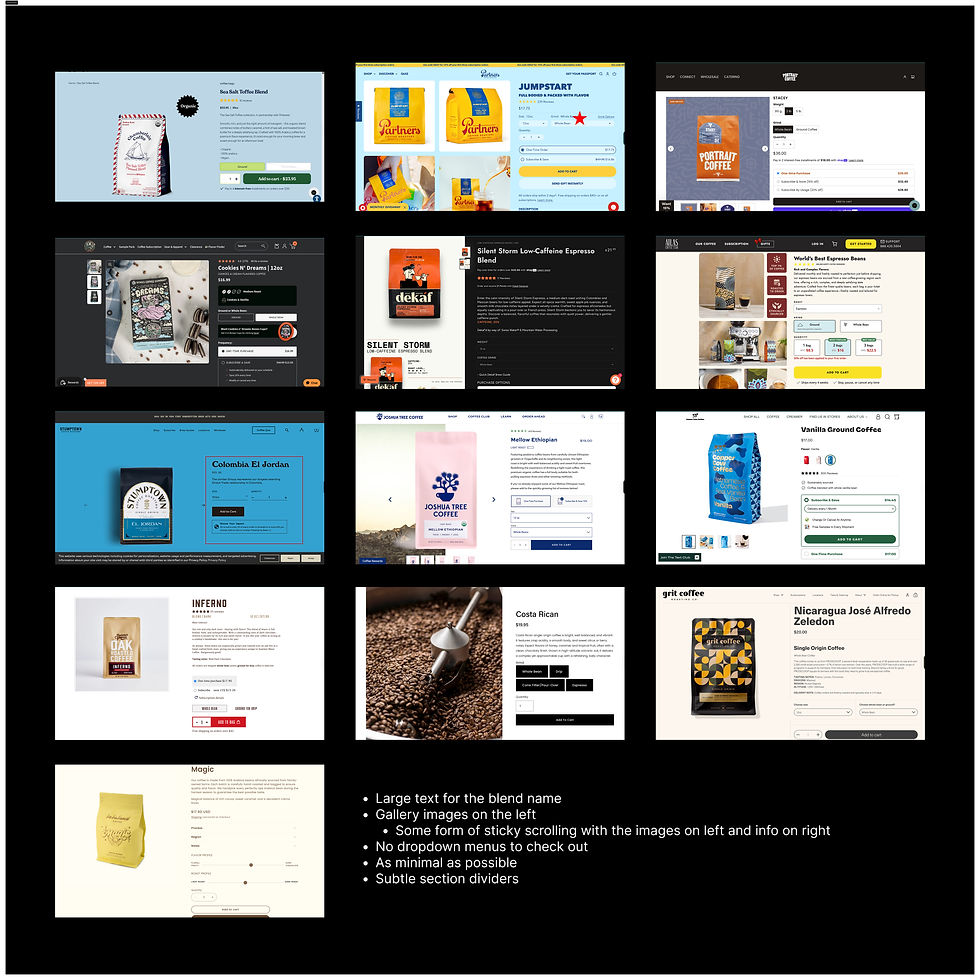
Research and Discovery
I began by gathering extensive research on contemporary coffee ecommerce websites. I collected screenshots and made annotations on what worked well in terms of hierarchy, layout, photography, and micro interactions. I also noted patterns that felt cluttered or confusing so that I could avoid them. This research helped to guide me as I planned out the structure of my page.
Hero

Coffee Cards

Company Details
Moodboard
My moodboard established the overall emotional tone for the brand. It drew inspiration from religious imagery, cloud motifs, heaven-like visuals, gothic typography, and high contrast light and dark elements. The palette centered on off white and deep black.


Sketches
I created loose layout sketches to experiment with structure before designing anything digitally. These sketches helped me explore image placement, grouping, hierarchy, and how each section would lead into the next. They also helped me determine how much visual information each block of content needed.
.png)
.png)


.png)
Digital Sketches


.png)

Full-Site Wireframe
After sketching out the initial structure of my website, I consolidated the ideas into a single full page wireframe. I created this wireframe at a relatively high level of fidelity so that the layout, hierarchy, and content blocks were fully defined before moving into visual design. This allowed the transition into the final design phase to be smooth and intentional, with a clear framework already in place.
.png)
Final
The final High Fidelity product page brings the Holy Grounds brand to life through:
Branding: A custom wordmark, a minimal color palette of off white and black, and coffee bag mockups that reflect the tone of the site.
UI Elements: Hover states and tasting note reveals that support the story behind each blend.
Imagery: Photos edited to reflect each blends flavor profile, such as pears, jasmine, or caramel appearing behind the product mockup on hover.
Copywriting: Warm, cheeky, and reverent language that fully commits to the Holy Grounds personality.
The result is a product page that feels intentional, cohesive, and expressive while still being functional and clear.
Reflection
This project taught me how to balance creativity with usability. I learned how to translate a playful brand into a fully functioning product page. I also deepened my ability to research patterns in ecommerce design and to combine those insights with unique and expressive branding.
Most importantly, Holy Grounds helped me practice building a world around a product, not just a layout.

Let's Work
Together
info@mysite.com
123-456-7890
500 Terry Francois Street,
San Francisco, CA 94158
Home
About
Contact
© 2035 by Business Name. Made with Wix Studio™